Online Portal
Project Overview
The AppFolio Online Portal is where our customers' tenants and homeowners can log in to make payments and submit maintenance requests. AppFolio wanted to update their online portal to be modern and work well on mobile devices to attract more customers and more tenants and homeowner all-the-while, maintaining an experience that was generating consistent revenue for the company.
My Role
As the team's product designer, I was tasked to define a scalable design for our online portal. I led the research and design for the project's discovery and early delivery phases. I was an active part of strategizing delivery and prioritization of features.
Understanding current and future needs
Before addressing the opportunity as stated, our team wanted to assure we knew where the most value would be for our work. Redesigning the portal was a valid focus, but if there was more opportunity we could address in the midst, we wanted to be at least aware of it.
Customer Surveys
We did an initial inquiry with our customer base to learn more about more they wanted from the online portal from improvements to additional features.
Internal Assessment
We conducted stakeholder interviews to understand what others in the business thought could be improved in the online portal based on their experience with users of the portal and where they saw growth opportunities for our business that may involve the portal.
Synthesis
We brought both the customer and business feedback together to create a definitive list of what we understood everyone wanted from the portal. With this list, we could prioritize where to apply our efforts and inform future efforts to improve the portal that may require more research.
Synthesis: we enumerated all the features the portal should entail to understand if they were already part of our considerations.
Developing the interface
Our opportunity was already well-defined, but what additionally arose beyond the initial brief was the focus on making the portal design scalable beyond its current set of features.
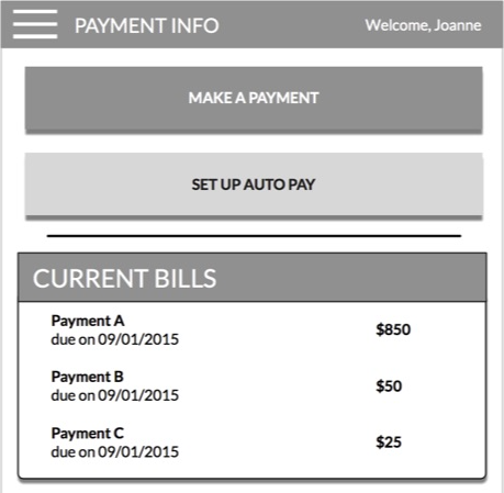
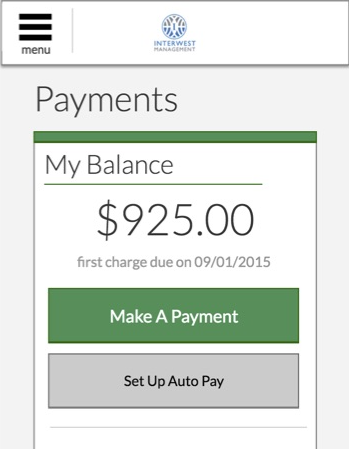
One of the first evaluations we did was of two different metaphors for our home page. I had done comparative research with personal finance tools and transaction-based interfaces and narrowed in on a card-based interface (left) and a launchpad style interface (right) for our consideration:
The two home page prototypes we initially evaluated
What we quickly learned was that in this type of portal, users wanted the view to provide information concisely without having to do much interaction, especially since the depth of user flows in the portal were not too involved and were not performed too often.
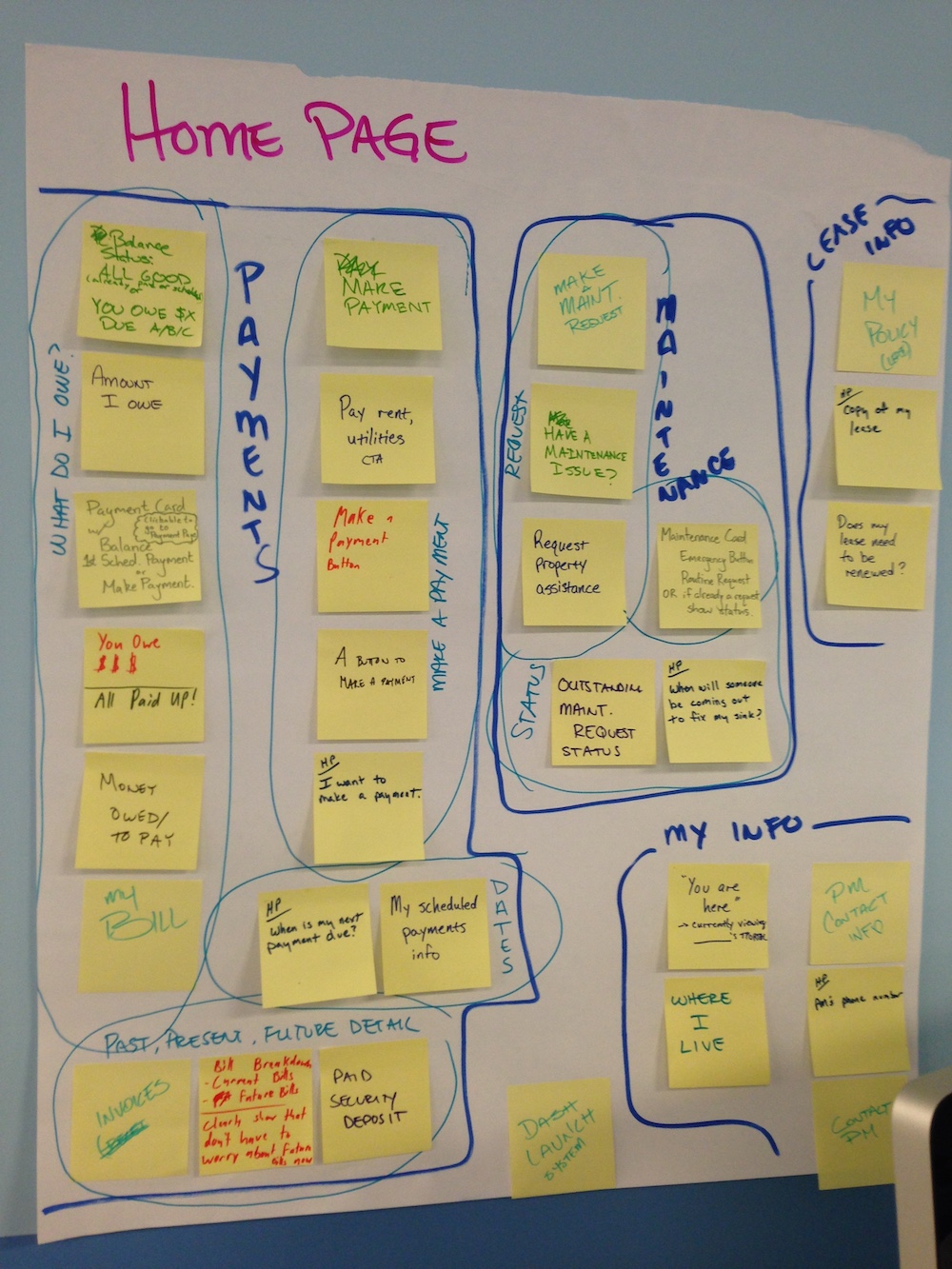
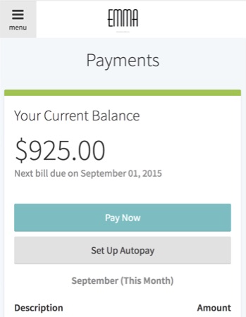
With this learning and our research, I did an inventory of the types of cards both customers and internal stakeholders mentioned they may want to include in the portal in the future:
Sampling of cards based on research
Prototyping & evaluating concepts end-to-end
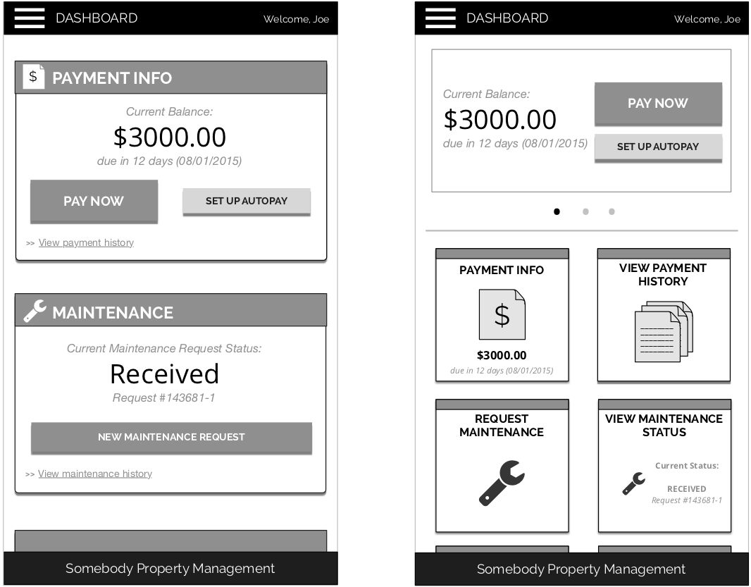
With ideas in-hand and understanding our initial goals of maintaing successful usage and adoption of the online portal, I set out to create an interactive prototype we could use to do usability testing with.
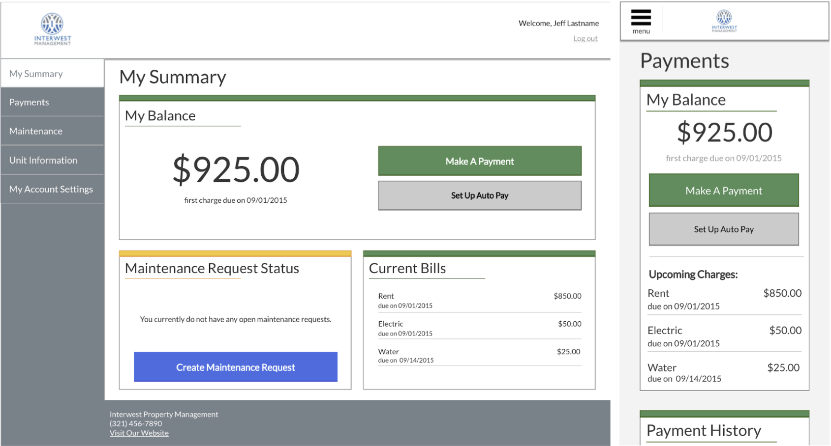
Initial desktop and mobile prototype used for usability testing
Through usability testing, we learned more about the nuances of the portal and waht we could introduce in our MVP that would benefit users. These features included showing a breakdown of expenses in the payment flow itself, color-coding the status of maintenance requests, and information architecture changes that would make the header and footer of the site simpler.
This prototype also guided the engineering team members in developing what would become the interface. The prototype was also used in partnership with our visual design team to develop a pattern library to help assure we wouldn't have to redefine styles in the future.
Designing for our customers’ customers
At AppFolio, we provide a product and services to property management professionals who then provide services to tenants and homeowners. Within what we provide customers, there are opportunities for AppFolio to have a direct effect on the tenant's experience and that's done through the AppFolio Online Portal.
In understanding that, we had to make sure our design and implementation decisions aligned with user and customer goals. Getting access to our customers' customers began as a challenge. During our research, some customers let us know that they wanted to maintain the portal as a channel between their company and the tenant, and no one else.
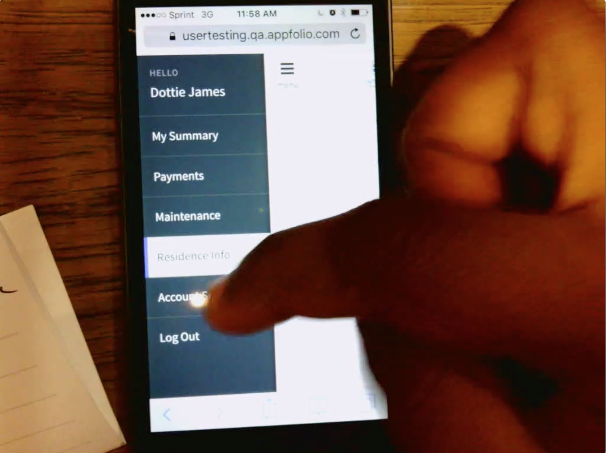
Snapshots from moderated and unmoderated usability testing
Even though some of our customers expressed this sentiment, others were OK with us testing with their tenants and homeowners. We also understood that anyone who fits the profile of a renter or homeowner could evaluate our design decisions so we conducted guerilla testing of our prototype as well as formal moderated and unmoderated testing on mobile and desktop devices with various people, some of which happened to use our portal or similar portals to make payments.
Scalability & component design decisions
Going through the process of developing the interface and doing usability testing created clarity in how the team, and the business going forward, could create a scalable interface from the menu to the pages themselves. I developed the following design principles for the portal that are used today as more teams develop features and implement changes to the portal:
Responsive
Making the portal work well on mobile devices was a priority. At the time, users had to pinch-and-zoom if they were using the portal on a mobile device. We chose to make the site responsive, where components did not have to be redesigned or scaled poorly depending on your device’s size. This decision allowed us to focus on having to make design choices once that would work for all devices going into the future.
Modular
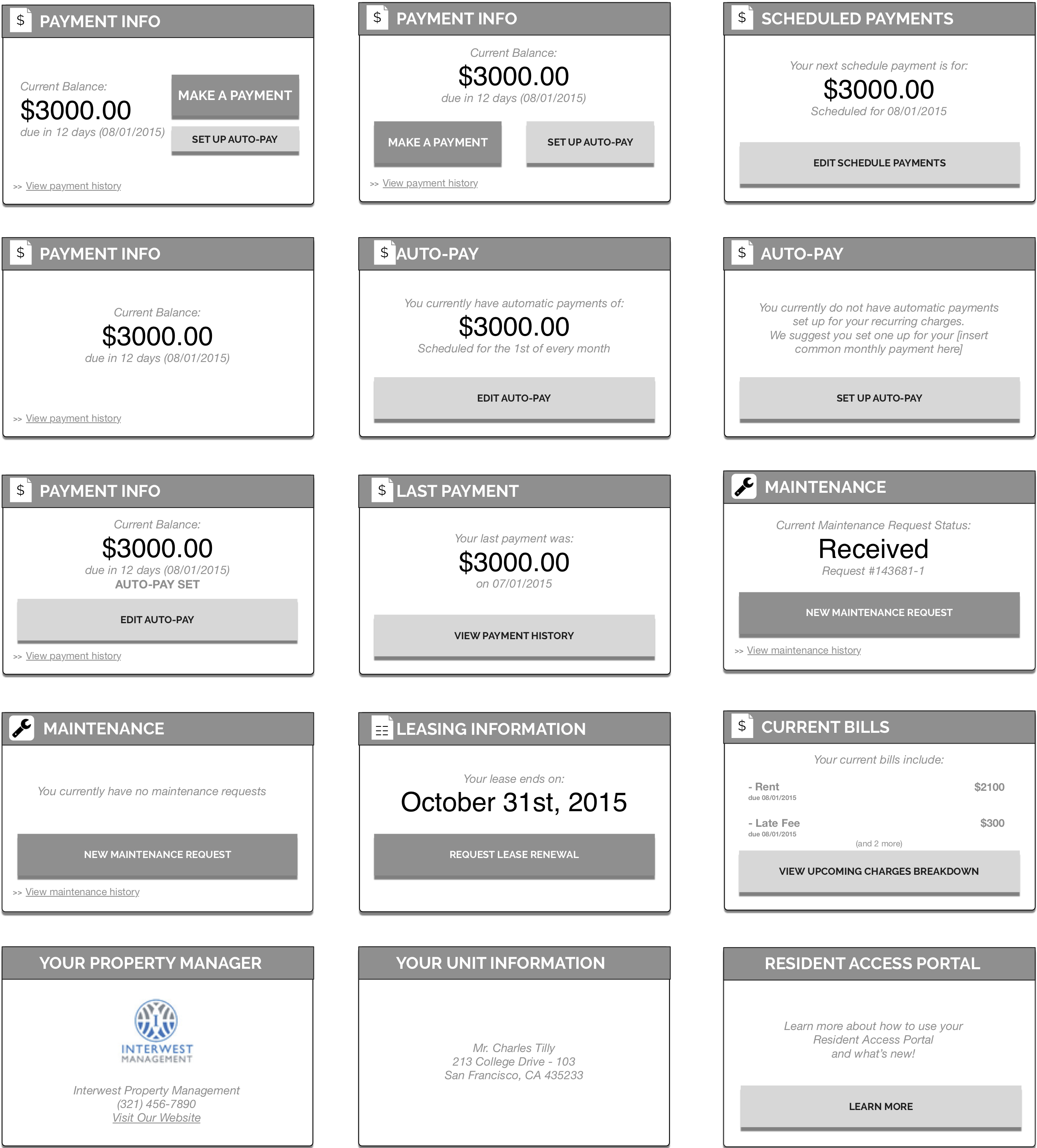
We decided to use cards as the primary content component for the portal. Cards could be used on the home page to show overviews of each subpage and then when a user navigated to a subpage, they could continue to find parceled, organized information in the same format.
Scalable
We wanted to assure that if additional features and content were added to the online portal, the considerations of how to introduce these features would be minimal, allowing teams to work smoother to evaluate their additions without the overhead of creating new components.
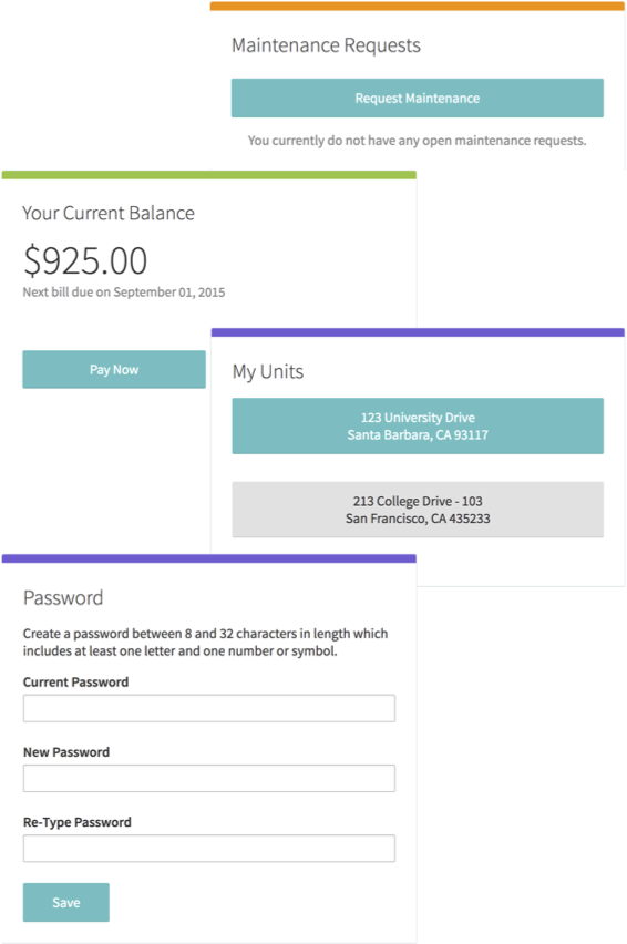
Sample of online portal cards
From prototype to product
After rounds of iterating, testing, and evaluating of mobile and desktop prototypes, the team was able to converge on a design we all felt met the needs of our customers and their tenants and homeowners.
We went from evaluating dashboard ideas through dot-voting set up in our office kitchen to more in-depth testing where users went through all of the functionality the portal had to offer.
Progression of portal design from initial wireframes, to interactive prototype, to the final product
This was followed by a beta release of the portal to tenants and homeowners who had not seen or used the portal before. This release strategy helped us understand whether conversion rates in our new flow would be comparable or better than conversions in our current flow. This strategy, similar to the testing-with-non-users strategy, helped us get an additional dimension of perspective from users who hadn't interacted with our portal before.
Result
Usage of the online portal overall stayed consistent as we continued to have more tenants and, homeowners use the portal. Since the update, mobile usage of the portal has increased and surpassed desktop usage.
Myself and the team were awarded a 2017 American Web Design Award for The Best in Web, Interactive + UX Design for this work.
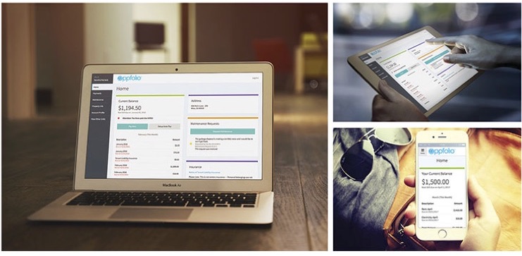
Scalability coming into play
As shown in the screenshots below, additional features have been added to the portal with minimal friction to the design and the company continues to seek opportunities to improve users' experiences not just with their property manager, but also with AppFolio.
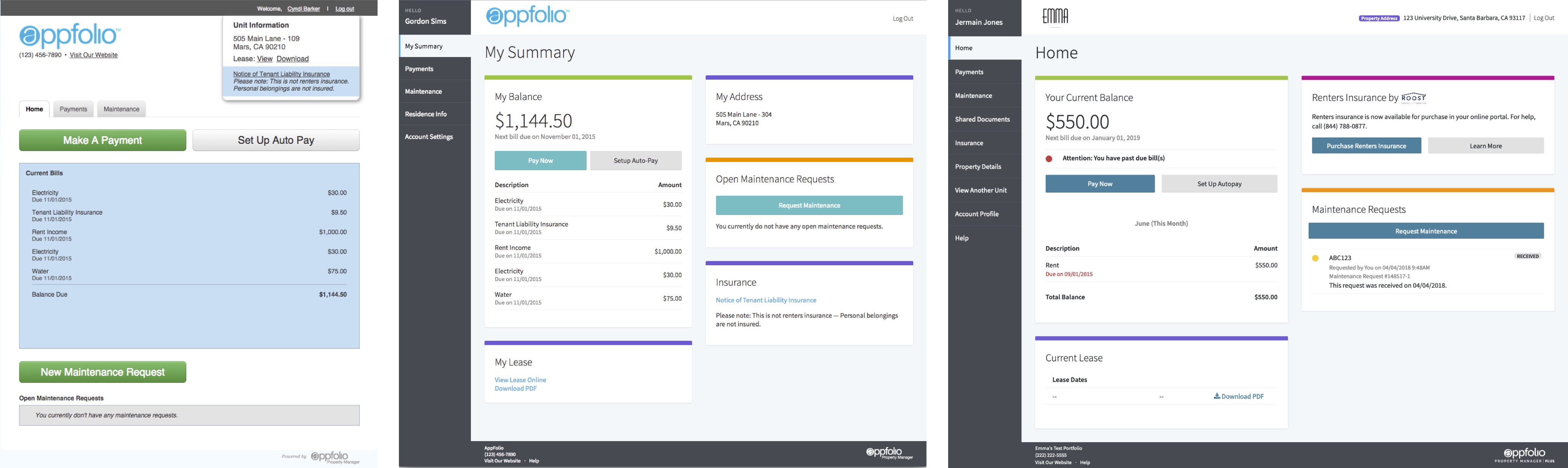
Progression of AppFolio Online Portal Design from the initial design, to the end of my involvement on the project, to today.