TaskAmbient
Project Overview
For my master's thesis, I conducted research in understanding the impact of an ambient display used as a personal task management reference tool. I hypothesized that TaskAmbient would be valuable to users based on its ability to aggregate information across multiple applications (email, calendar, checklists) and delineate information based on user-defined groupings. The visual metaphor being available on an ambient display also supported the hypothesis that information availability without having to navigate through various applications would be of value.
My Role
This was a solo project for my master's thesis in human-computer interaction. I was designer, researcher, and developer.
Personal task management and intention retention
At the time I started my research, many tools were becoming popular in the space of personal task management (Google Inbox, Check, Fantastical) and I was curious if these were cases of “just-another-app” and if there was an opportunity to revisit the underlying issues people face with personal task management.
For my work, I keyed in on the underlying variable of intention retention. Intention retention is basically remembering that there is something to remember; the classic string-tied-to-the-finger.
I found that aside from time and location- and time-based notifications that personal task management tools can provide, there were very few personal task management tools that facilitate what can be described as a pseudo-serendipitous reminder to do something that didn't have a definitive deadline, so I began researching more into personal task management practices and what types of technology could be used to support such an idea.
Survey of personal task management practices
To start my research, I wanted to validate whether intention retention was truly an issue people faced when using personal task management tools.
In my survey, I also wanted to validate the value of aggregating personal task information across tools. This is another aspect I assumed would aid in intention retention; having all the intentions in one place.
Findings of note:
51%
51% of survey participants mentioned that they “always” or “most of the time” refer to their personal task management tools to remember what they need to do. This overhead of navigating just to realize there may or may not be something to tend to can be tedious.
77%
77% of survey participants in the survey mentioned that aggregation of personal task information from the various tools they use could be valuable to them.
6
Participants mentioned that there were on average 21 tasks across 6 areas of responsibility (school, work, family, etc.) that they were managing in their memory.
With the information gathered from the survey and through literature review, I felt confident proceeding in ideating on a tool that could:
- aggregate task information across tools
- provide a path to on-demand intention retention
- delineate personal task information on a user-defined basis
- display uniform metadata of the task (dates, descriptions, priority)
Ambient Displays
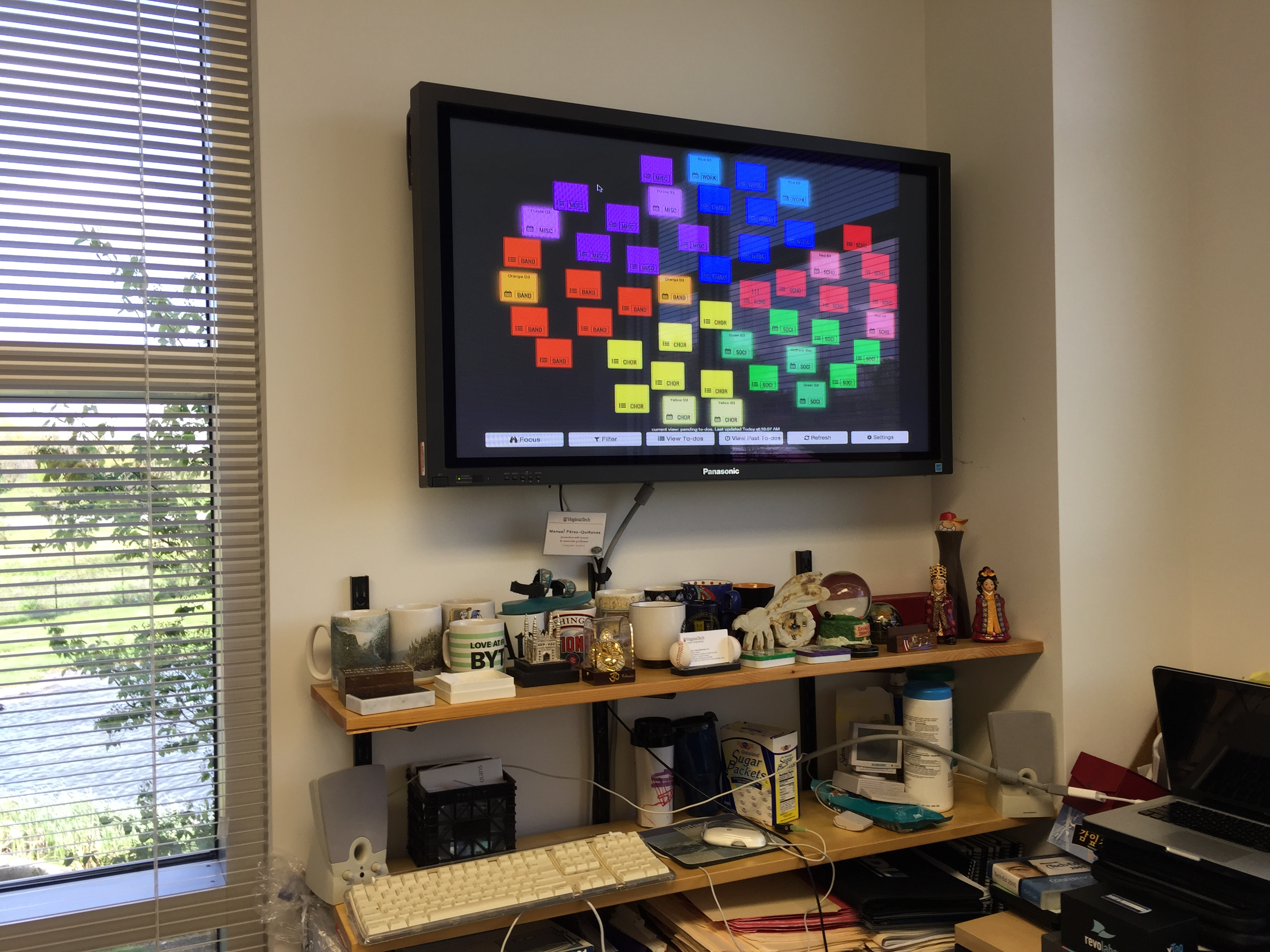
After investigating various concepts that could cover the needs described above, I came to the conclusion that an ambient display could be used. An ambient display being a display someone has in their workplace, room, or household that isn’t meant to take a user’s primary attention. Instead, the display changes state and can be glanced at to capture information. Think of it like a clock: you don't always need to look at the clock, but it's available for you if you need it and you can quickly tell the status (time) when you look at it.
TaskAmbient
After ideating on how to represent tasks on an ambient display as well as the needed functionality of the display, I developed a tool called TaskAmbient.
TaskAmbient provided users with the ability to login with their Google Calendar and a to-do list app created by my research group. Both would source TaskAmbient with task information.
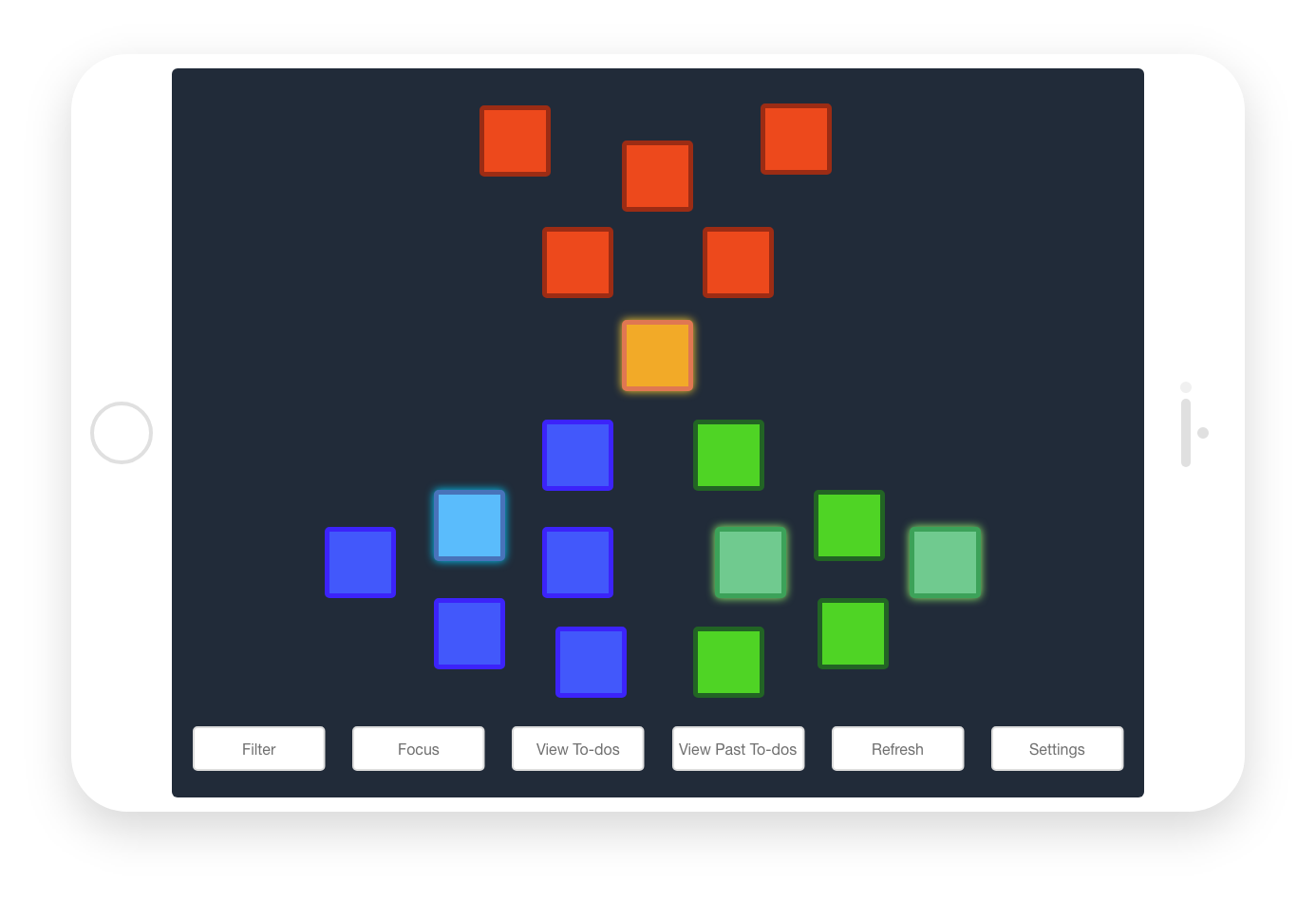
In TaskAmbient, users could define up to 6 areas of responsibility to group their calendars and to-do lists.
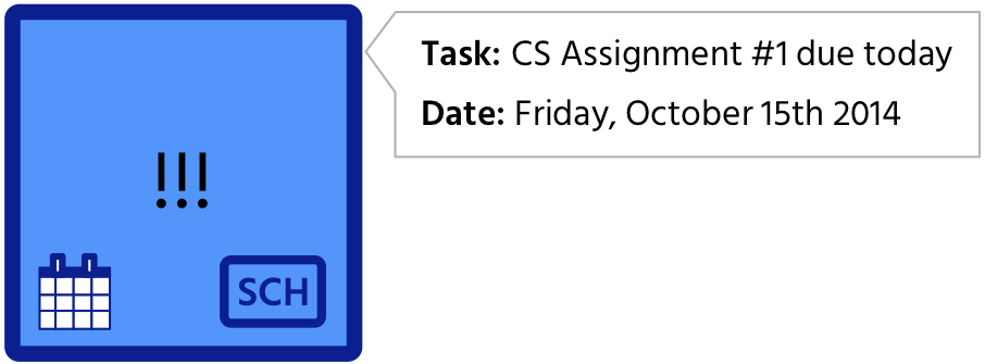
TaskAmbient represented tasks as “chips” on the display:
- The color represents the area of responsibility and is accompanied by an abbreviation in the bottom-left corner
- An icon representing the original source (calendar or list) is in the bottom-right corner
- If the task was marked as high-priority", "!!!" would appear in the center
- When tapped or clicked, a description would appear on the display
- If the task is within a user-defined threshold, the chip would glow if the task is upcoming
Users could filter and refresh the view, view past to-dos, and adjust settings such as adding and regrouping calendars and to-do lists and setting the time threshold for a chip to glow.
In all, the key design tenets of TaskAmbient were:
Visualized
TaskAmbient visualized information commonly stored in different formats across personal task applications
Aggregated
TaskAmbient aggregated tasks across personal task applications that users referred to when gathering task information
Delineated
TaskAmbient delineated task information based on user-defined categories, to orient task information around their mental model of organization
Glanceable
TaskAmbient was glanceable, meaning a user did not need to interact deeply with the tool in order to gather information that may be useful
Longitudinal user study
To evaluate TaskAmbient, I conducted a study where I gave users iPads to use TaskAmbient in their homes and workplaces. They used TaskAmbient over the course of 6 weeks and I conducted weekly interviews with participants to learn about their usage. Participants were also given a brief survey twice a week to let us know how they recently used TaskAmbient.
Overall, TaskAmbient was received well by participants but needed further refinement for higher adoption. Integrations with other personal task management applications and the ability move chips on the display were the most-heard feedback received. It was also mentioned that a lower barrier of interaction was desired to know what the chip was about, so potentially providing a blurb on the chip itself would have been valuable.
Although designed for use on an ambient display, since the app was web-based, users noted value in being able to use TaskAmbient on their primary devices.
Result
This was my master’s thesis work, so with it, I was able to graduate!
This work was also published as an extended abstract in the Proceedings of the 33rd Annual ACM Conference on Human Factors in Computing Systems (CHI EA).
In retrospect...
I learned a lot in the space of user research, software development, and UX design. Having to deal with hosting, creating and maintaining a database, API usage, designing surveys and user studies, and designing user interfaces was great to experience end-to-end over the course of the project.
If I were to conduct further research in this area, I would revisit my research on intention retention to get a better sense of how people were performing intention retention. A better understanding of the strengths and shortcomings of their current tools would have lent itself well to the design of TaskAmbient.
Also, I would look to incrementally design of TaskAmbient. In delivering a product, it is important to understand that you have satiated the initial needs of the user before designing on top of that. Although there was research backing the premise for a tool that could be a smart, adaptable forget-me-not, the design was driven by the form factor of the data. There may a have been a higher-level abstraction of this tool that could have served as an MVP, from which I could have learned more and continued development towards a more desirable tool.


